Podcast Nanny
Out of the box web platform that stands as a one-stop shop for podcast producers
branding
product design
UI/UX design
frontend dev
First things are first. Honestly, they are boring and complicated. They all target advanced podcasters who have a solid experience in the podcasting world. They have multiple services and multiple options for each of them. But when it comes to beginners, they have no idea which is right for their needs. Because they don't know what they need. Yet... All they want is a kick start. An easy, simple and reasonable one.
Nevertheless, recent podcast services are so far away from being positioned for reflecting the spirit of this crowd and having proper emotional communication with them.
So at Podcast Nanny, we aimed to target millennial podcast producers who are looking for a simple start to get into the podcasting world.
After market research, remote and in person interviews with 42 potential and recent podcast producers, the roadmap to overcome all of these problems were defined:
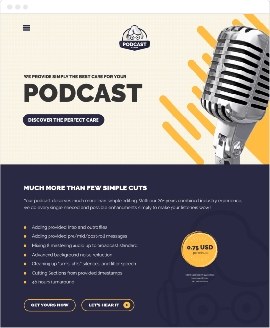
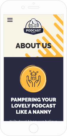
In view of the fact that creating a bold and memorable experience, it all started with designing the branding. The purple and yellow colors have been chosen for reflecting the quality services presented at Podcast Nanny, while not compromising on the energetic, young look and feel which aimed for the target audience.
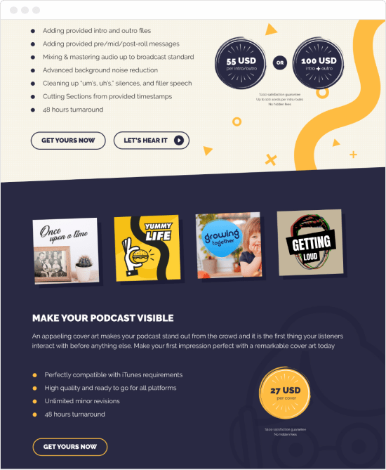
The next step was wireframing and determining the user flow of the web interface. As the user experience should be hassle-free and easy, we kept it simple. Actually very simple. Editing service had a flat price per minute and comes with a single option that covers everything a podcast producer needs. Also, podcast cover design services and intro/outro production services followed the very same method. A flat price and best scope for every single service.
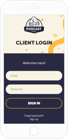
The order process is also another key point of flawless user experience. All payment and ordering process should be easy to keep the abandoned cart ratio at the minimum level. So we decided to eliminate the signup process before ordering. As soon as the user order for a service and complete the payment, the user account is being created automatically and user directly goes to the client area to answer few simple questions which are necessary for the recent order. So the order process is never longer than a few minutes.
For the best future user experience of ongoing clients, we collaborated with an Estonia based development team to integrate a CMS system that covers all ordering and support processes. All in one place and again, simple!
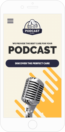
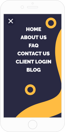
I also created the social media identity which plays well with the tone and feel of Podcast Nanny by following the same principles. Recently % 71 of the overall traffic came from social media. Therefore the usability on mobile devices is the priority. As we discussed the marketing strategy beforehand, we were expecting and prepared for this from the very beginning.
The whole interface including the CMS part has been designed and developed responsively for being able to respond to any kind of mobile device.
Designers like to create something, including me. No doubt about it. But the product design process is a much longer journey. So to understand the best user behavior and create a better experience, I am still testing the best practices with the help of Google Optimize and heat maps.
I already had some really interesting insights, especially for action buttons that are located on home page of Podcast Nanny. For example, it seems that “Grab yours” is working better than “Order now” That was something unexpected actually.
Overall, it was a great experience to be part of that amazing project from the early stages to the end.